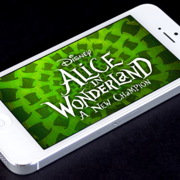
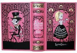
Alice in Wonderland: A New Champion
Leading UX on a Disney IP mobile game, from inception to launch.
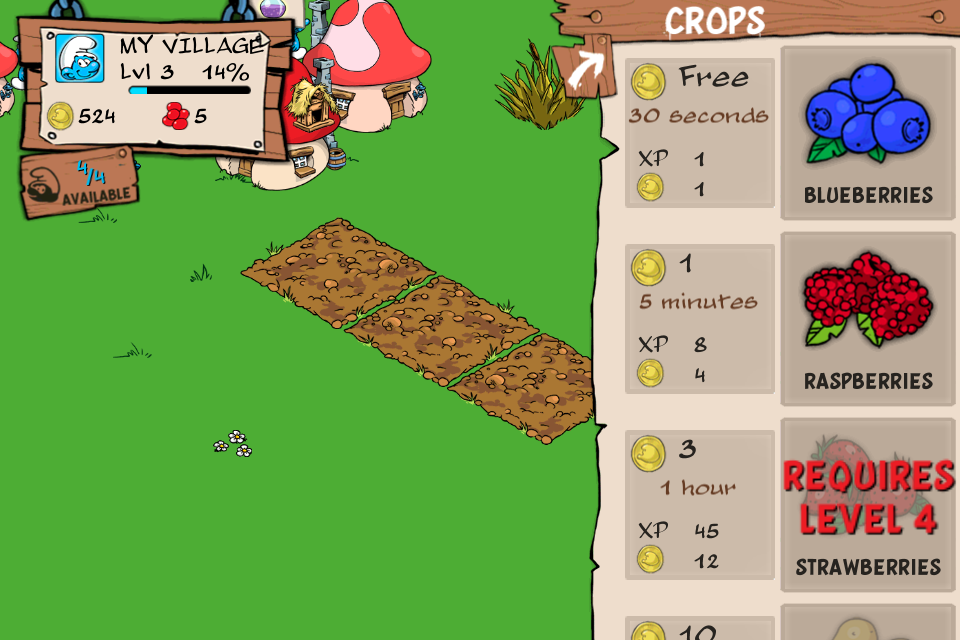
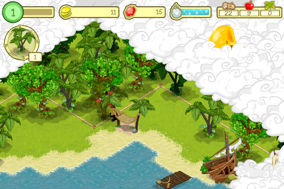
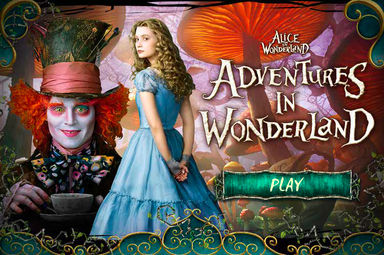
Alice in Wonderland: A New Champion was a mobile crafting and adventure game for iOS and Android, continuing the storyline from Disney's 2010 film. Players helped Alice and the characters of Underland restore the land after the Red Queen's reign.
I led the UI/UX team from the project's inception through launch and into post-launch, responsible for wireframing every feature and flow, creating the full UI asset suite, and implementing assets in Flash. I also authored all UX specs from production requirements, documented feature changes, and participated in all feature planning meetings — working closely with producers, engineers, artists, and stakeholders to define core mechanics and the game's narrative arc. Many of the visual samples were created in collaboration with other UI designers and artists on the team.
A beloved Disney IP, a new platform, and a lot to live up to.
Alice in Wonderland: A New Champion came out of the team's experience on Disney's Gnome Town — a Facebook-based city-builder that the Social Mobile team had shipped previously. The goal for A New Champion was to build on what Gnome Town had established, but address its limitations: simplify the UI, support a multi-screen mobile experience without relying on hover states, and solve for the constraint-heavy world of mobile game development within engineering limits.
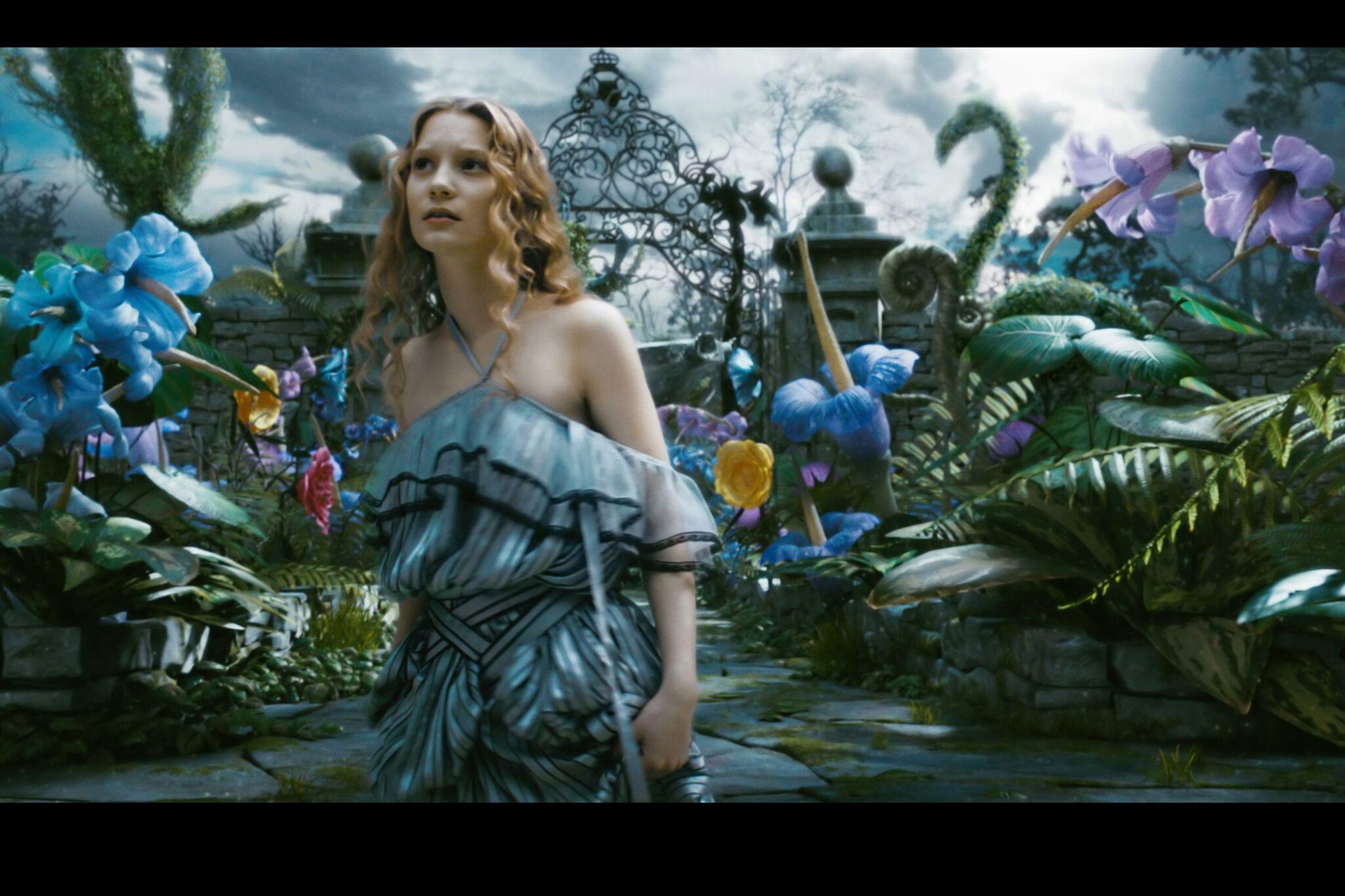
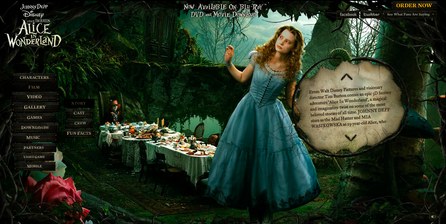
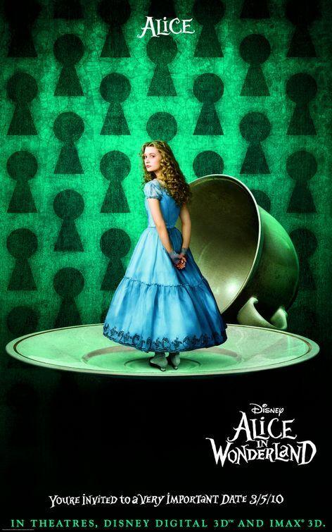
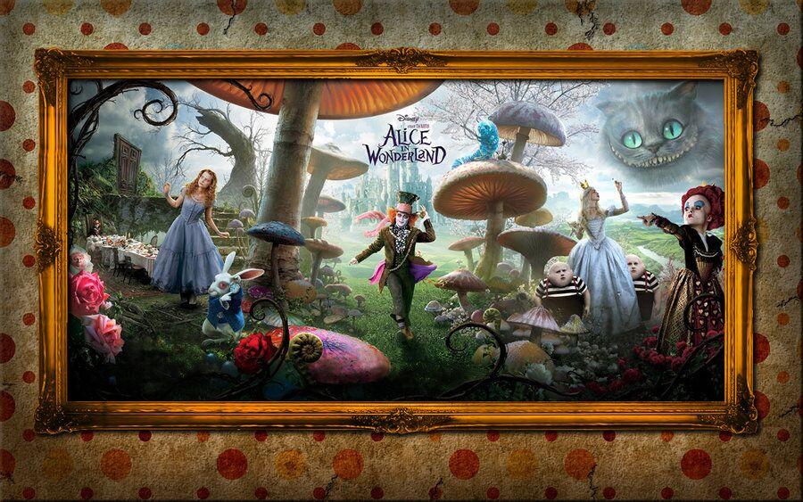
Working with a Disney IP raised the visual bar significantly. The game had to feel like Wonderland — not just functionally, but aesthetically. Every screen needed to hold up against the characters, the film's visual language, and the expectations players brought to a Disney product.
What we learned from Gnome Town.
Gnome Town was our reference point and our cautionary tale. A few clear lessons shaped the Alice design direction from the start. The UI had been too dense — too many elements competing for attention in a small screen space. We needed to simplify. The game had been designed with a single-screen mental model that didn't translate to mobile navigation; we needed to plan explicitly for multi-screen flows from day one. And hover states, which had driven interaction patterns in the browser-based game, simply don't exist on mobile — every interaction had to be touch-first.
Competitive analysis — mobile crafting and adventure games.
Before designing, I looked at the broader mobile crafting and adventure game landscape to understand where the genre was and where the standards were. What were players used to? What conventions could we borrow, and where were there gaps we could improve on?
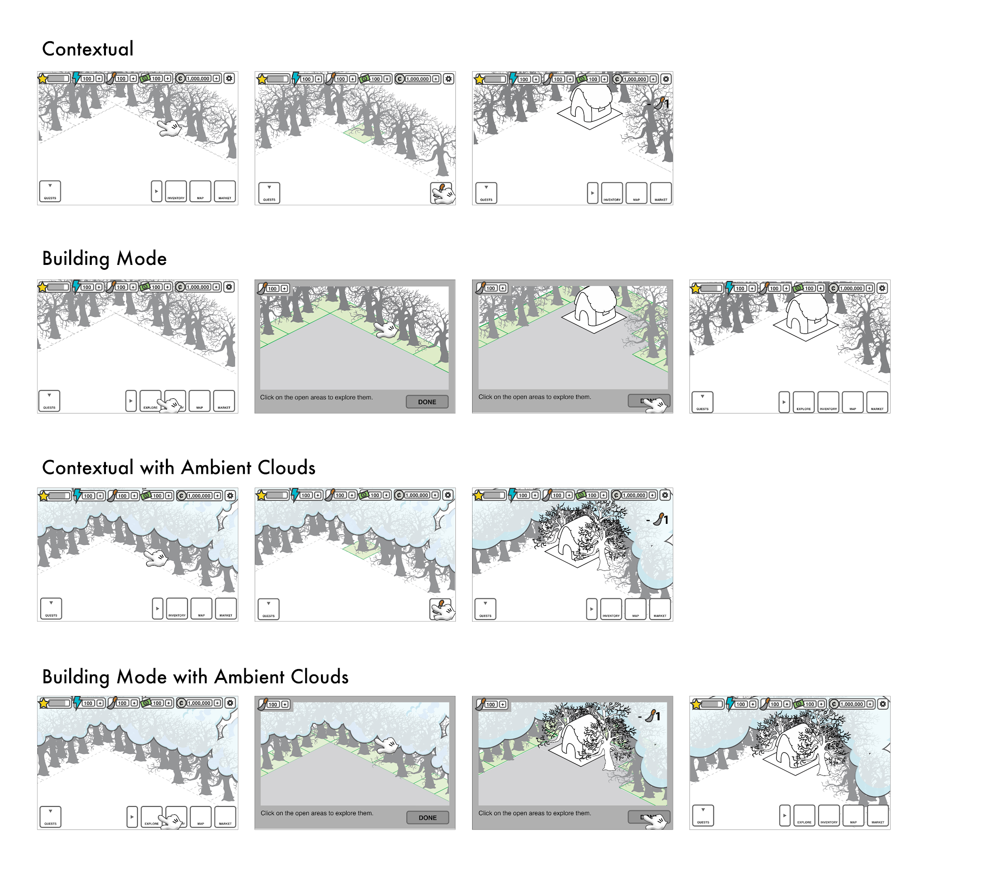
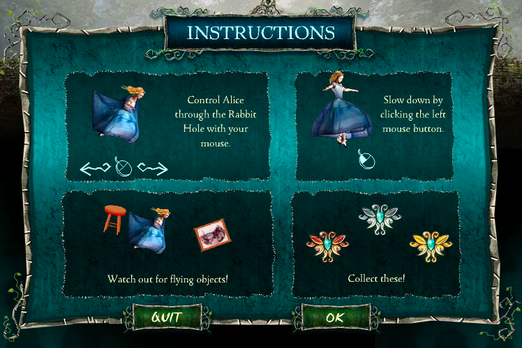
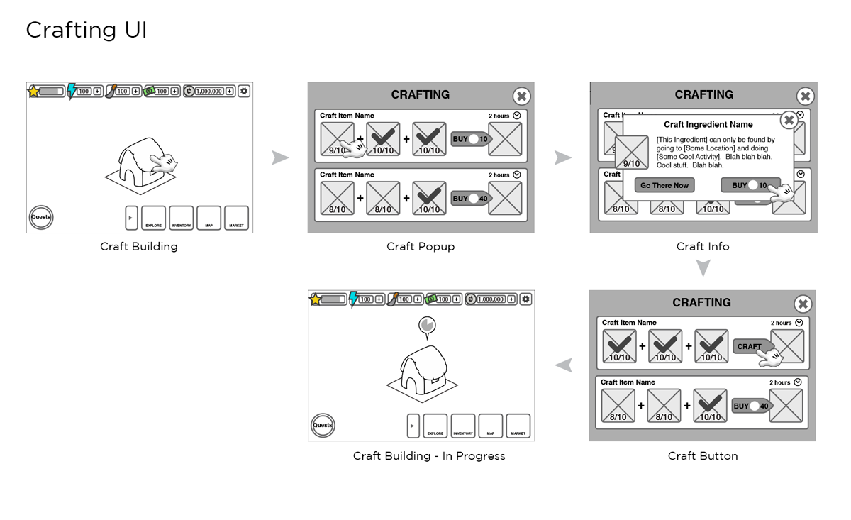
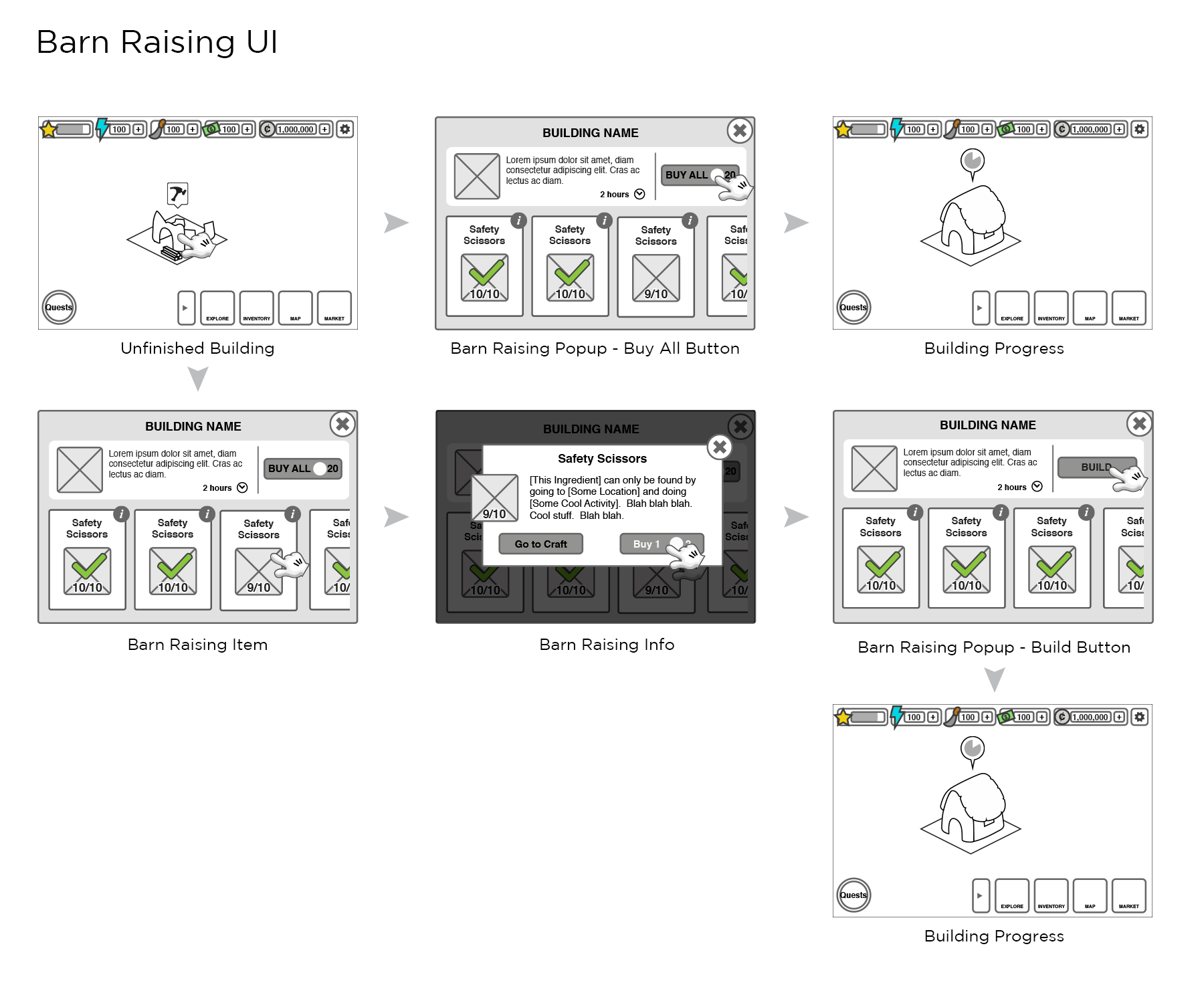
Solving for mobile without a cursor.
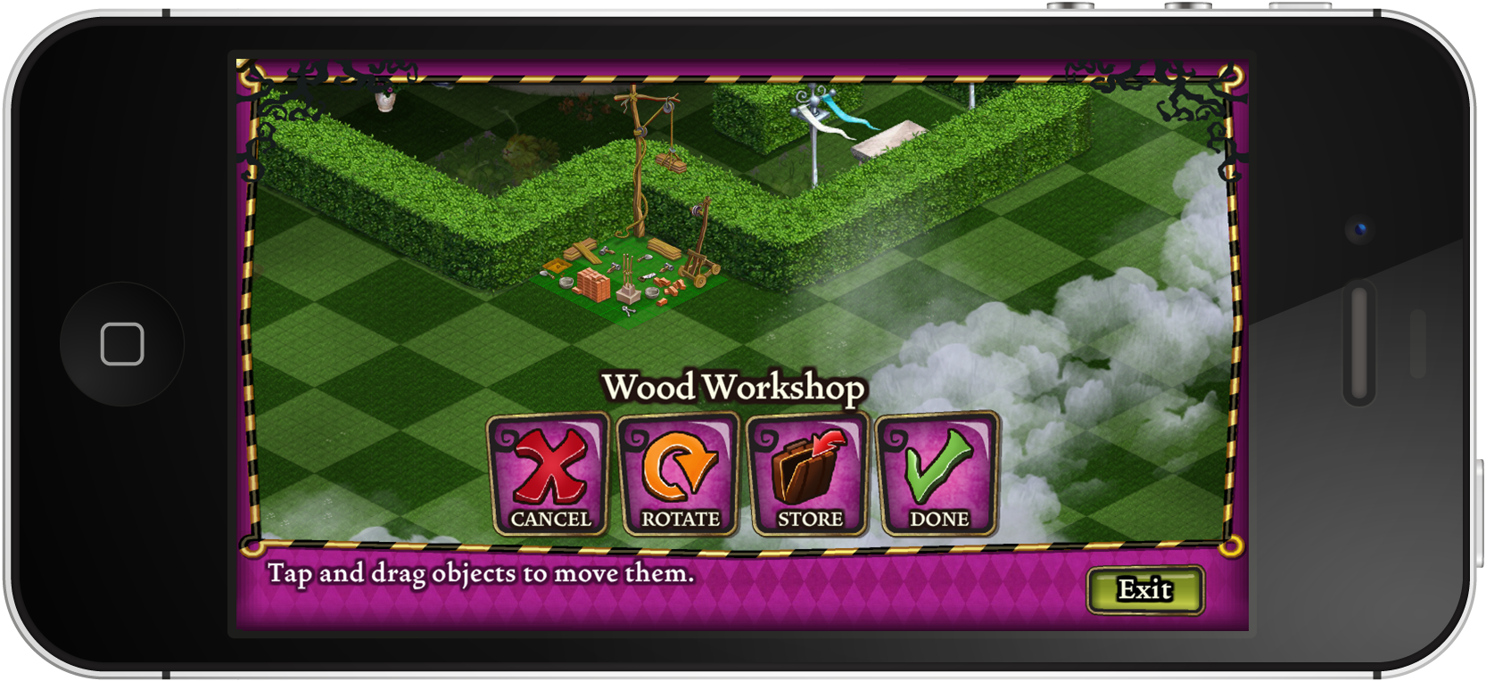
One of the central design challenges was the exploration and building mode interaction. In browser-based games, a cursor does a lot of work — hover states communicate intent, differentiate interactive elements, and guide the player's attention. On mobile, that disappears. We had to rethink how players would navigate and interact with the game world.
Two approaches were on the table: a contextual menu that appeared based on where the player tapped, versus an explicit building mode that shifted the entire interface into an edit state. Each had real trade-offs around discoverability, learnability, and touch accuracy — and we explored both before landing on a direction.
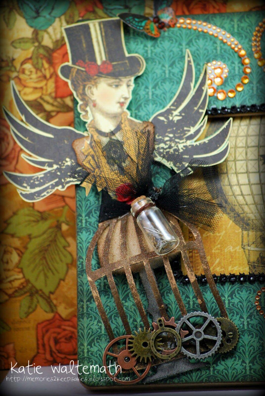
Finding the look and feel of Wonderland.
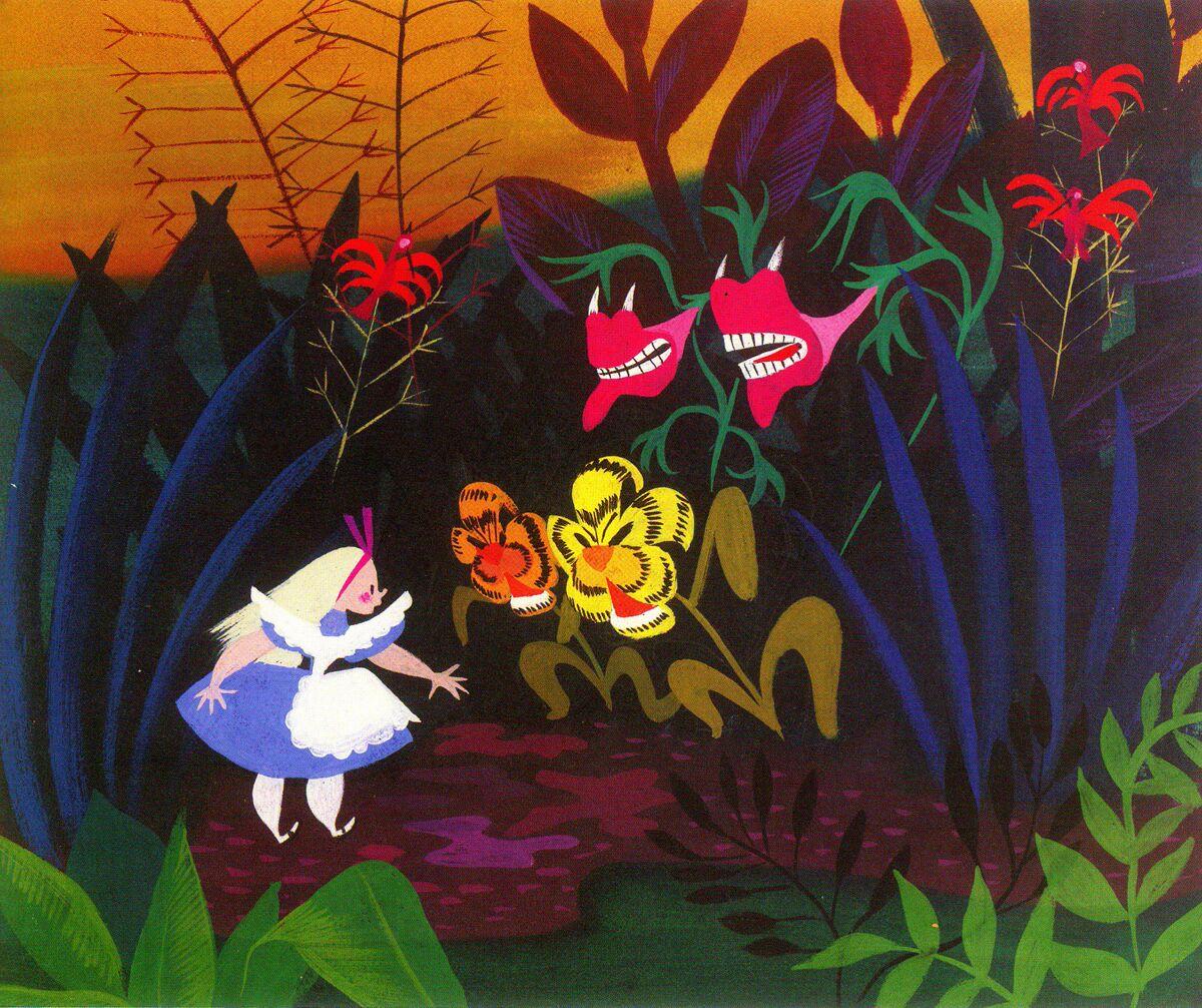
Before committing to any UI direction, I built out a visual mood board to establish the aesthetic language. The reference points pulled from the Tim Burton film aesthetic — which set a specific tonal mix of bright, saturated color with a slightly dark and whimsical edge — as well as Victorian illustration styles, ornate decorative motifs, and the fashion and environmental design of the film itself. The mood board was a way to get the whole team aligned on the visual world we were designing for before a single UI element was drawn.
Sketching out the game's visual world.
With a shared visual direction in place, we moved into brainstorming — rough sketches and ideation sessions to start translating the mood board references into actual game UI concepts. This phase was intentionally messy; the goal was volume of ideas, not polish.
Getting visual richness within engineering constraints.
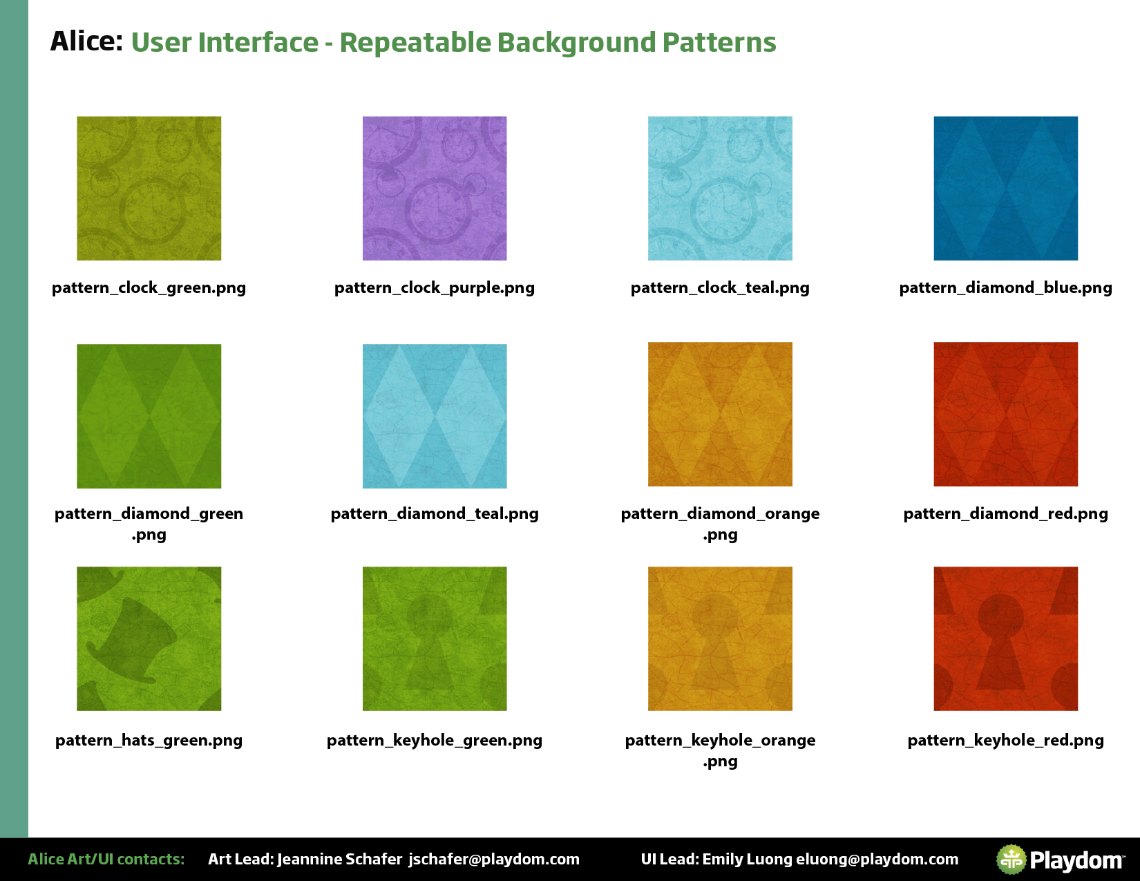
One of the ongoing tensions in mobile game UI is the gap between what looks great and what's technically feasible. Mobile has real limits around download size, texture memory, and runtime performance — and a Disney IP game with high production values meant we had to be strategic about how we built assets.
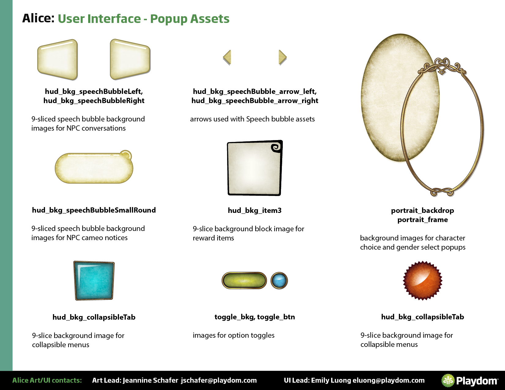
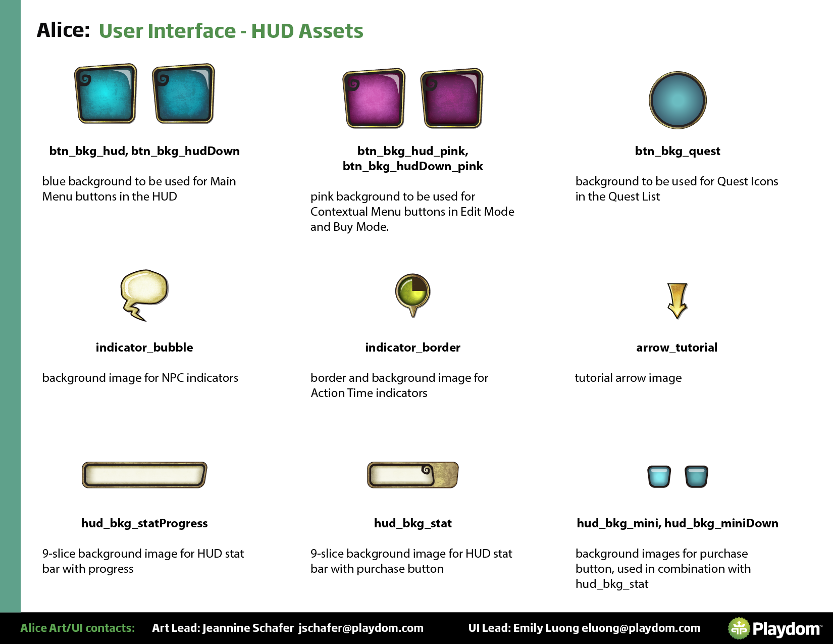
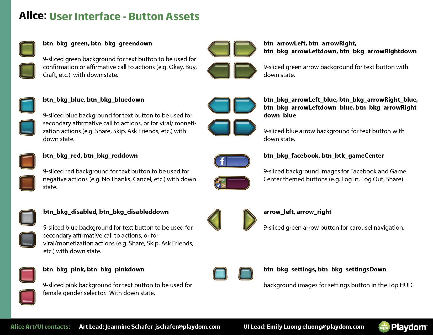
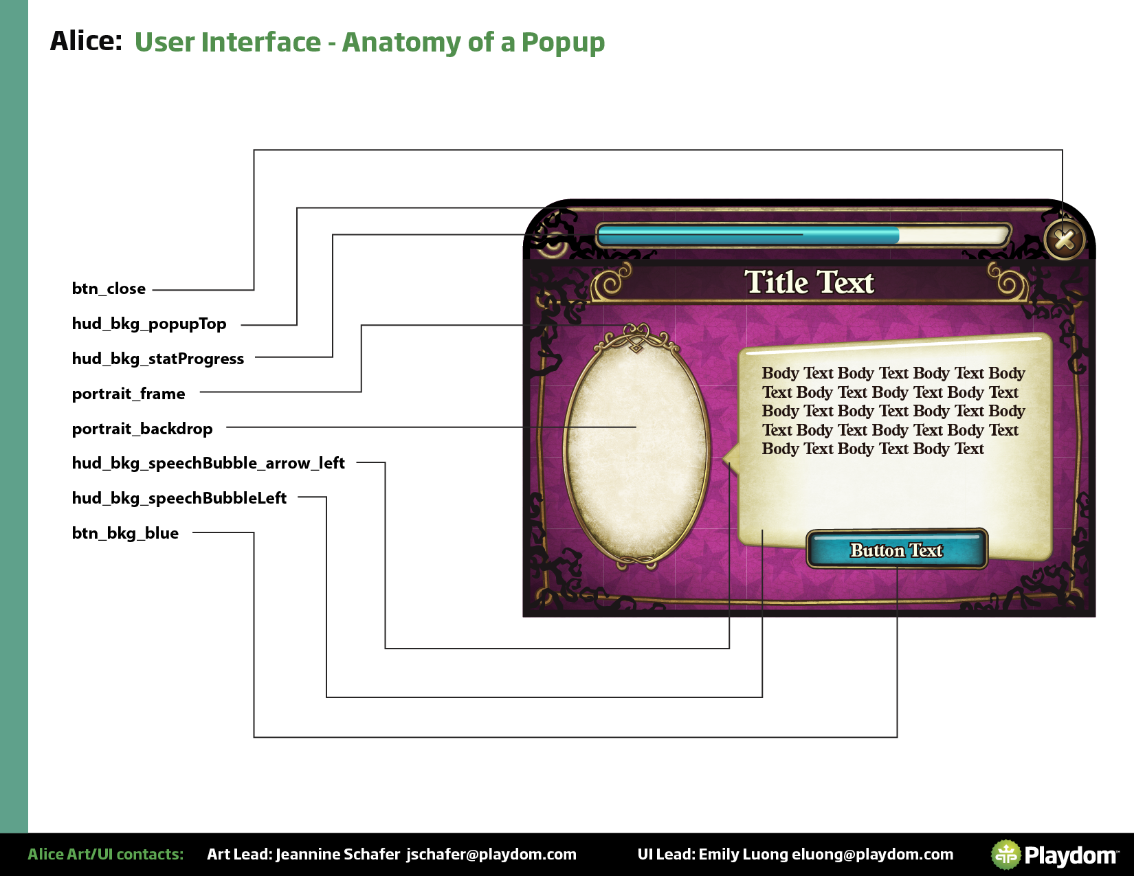
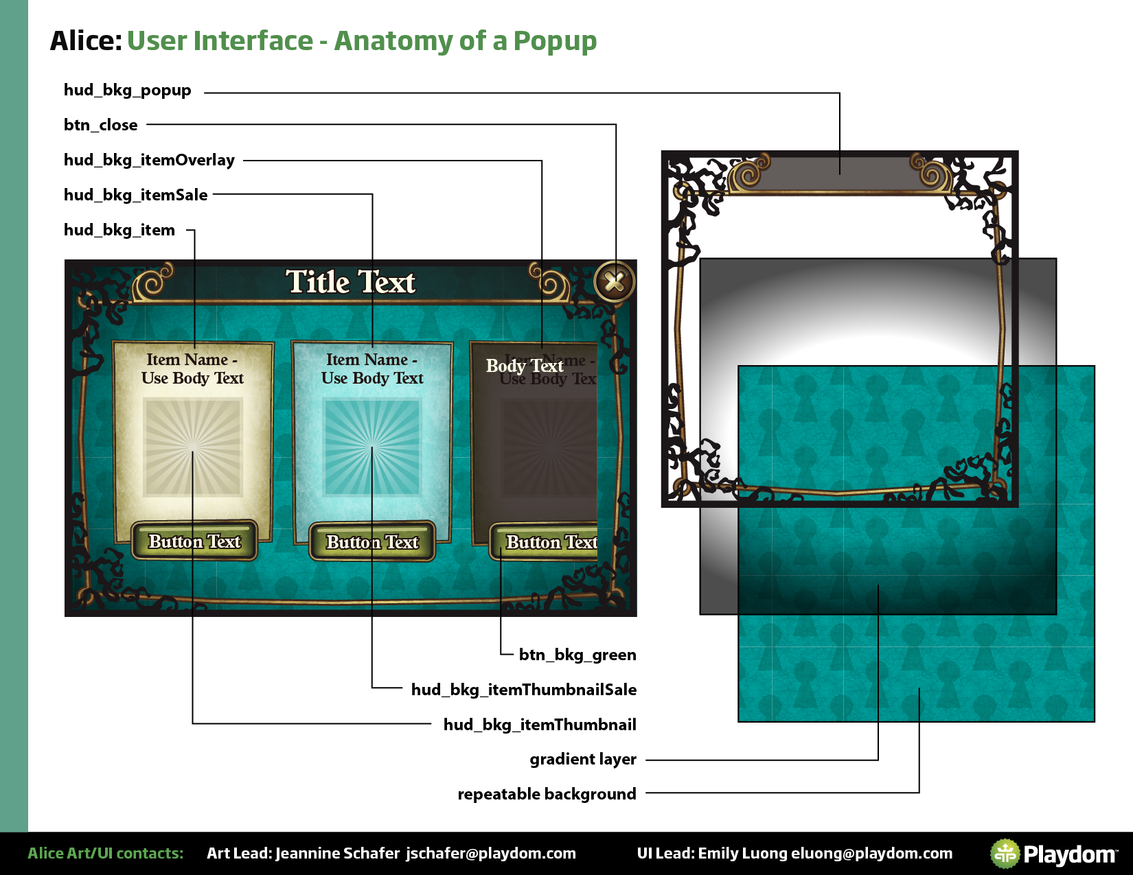
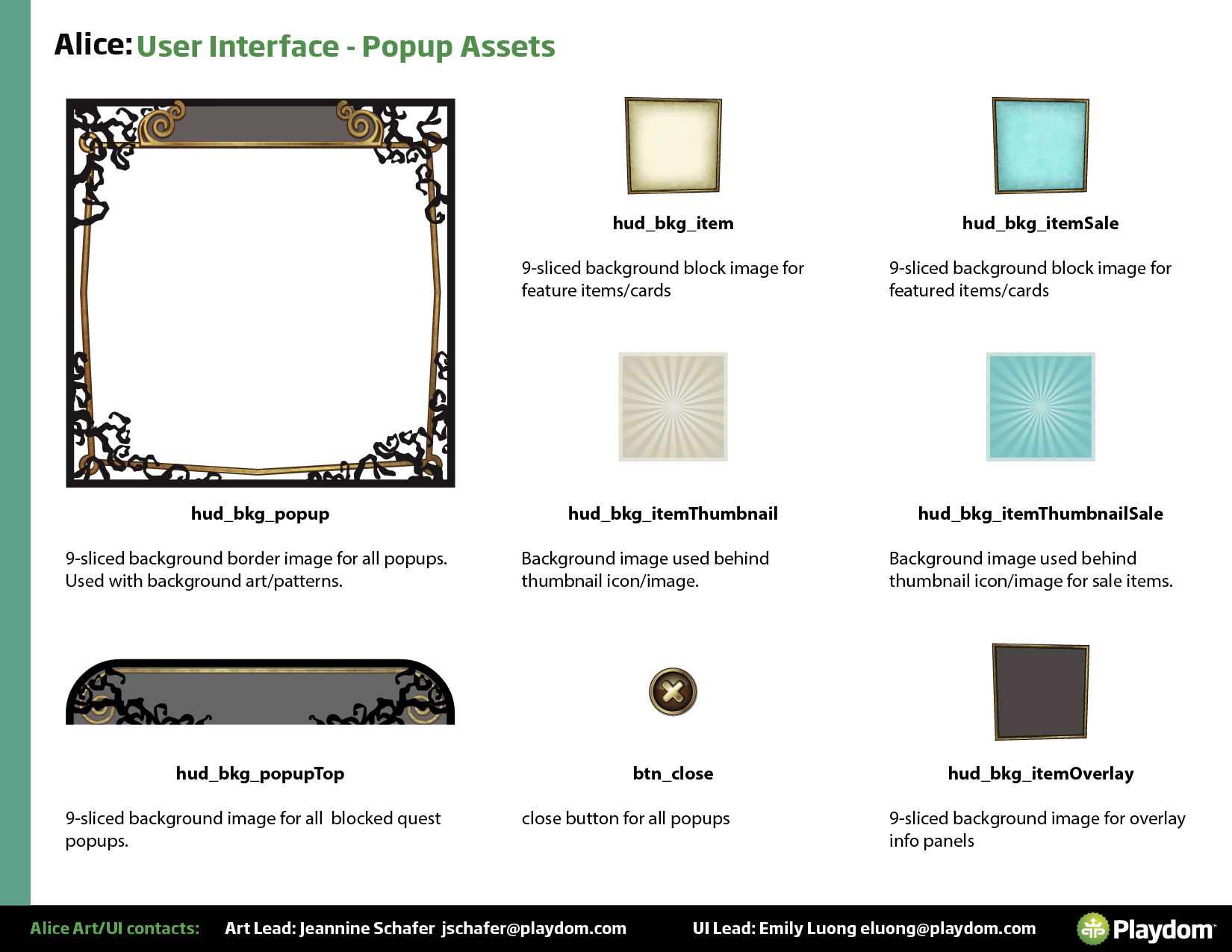
The primary technique was 9-slicing: constructing UI elements from scalable center regions and fixed corners, so a single asset could stretch to any size without distortion and without needing unique texture maps for every variant. This let us create visually diverse screens with a minimal number of actual downloaded assets. I worked closely with the tech artist and engineers to define which elements could be 9-sliced, how the slices needed to be structured, and where we needed full-bleed assets for quality reasons.


From design files to Flash — owning the full handoff.
The UI/UX team didn't just hand off assets — we implemented them directly in Flash. This meant I had a close understanding of how design decisions translated into the actual game build, and could make informed trade-offs between visual quality and technical complexity in real time. Being embedded in implementation also meant catching issues early that might have taken days to surface in a traditional design-to-engineering handoff.
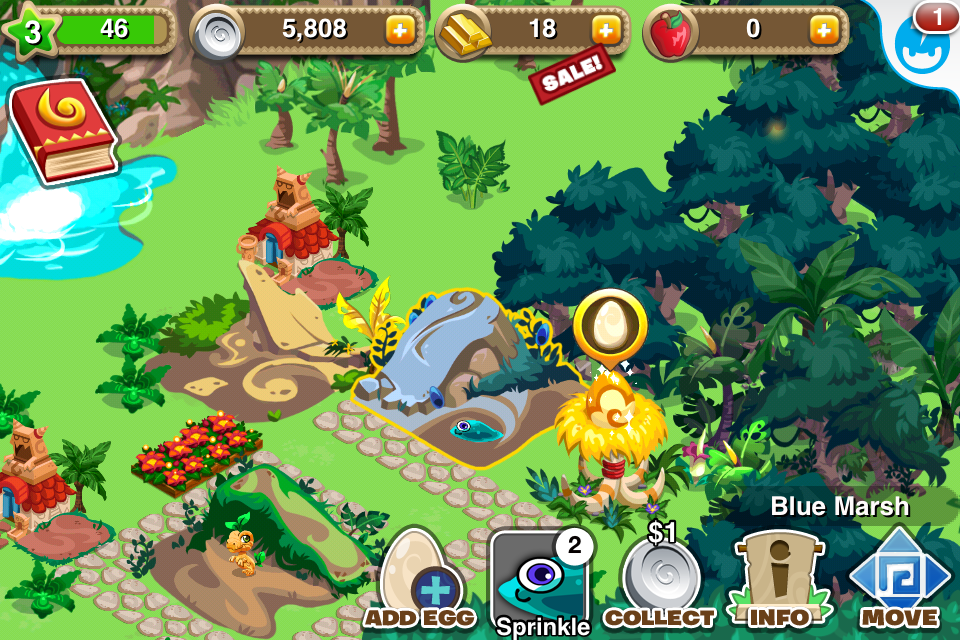
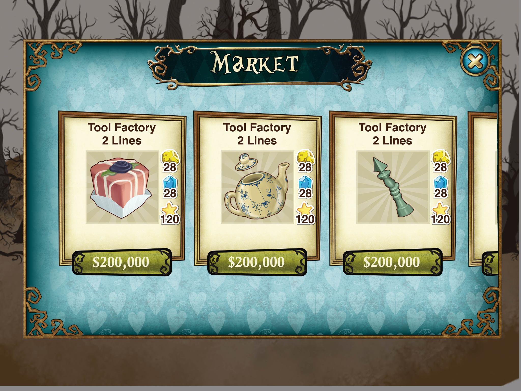
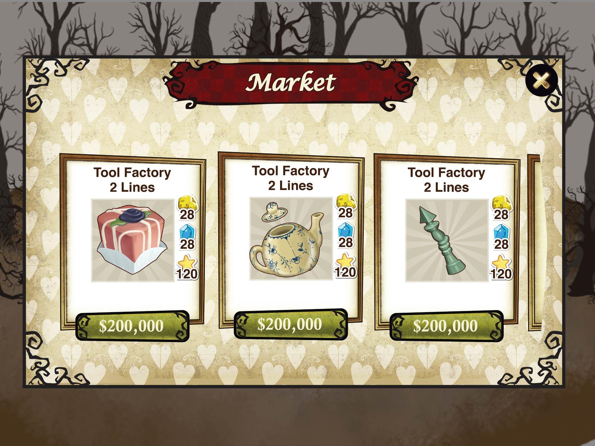
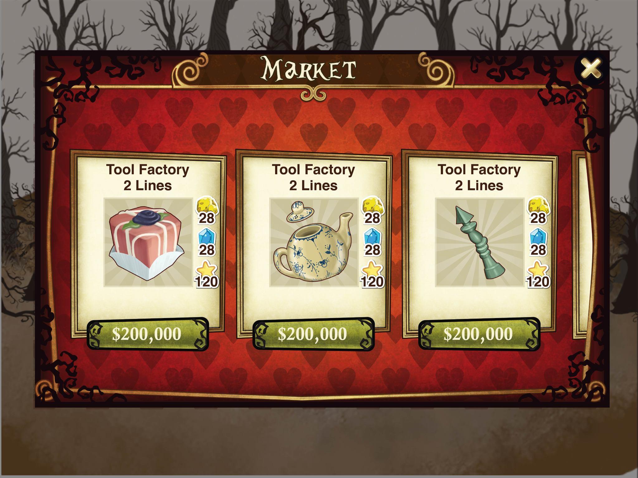
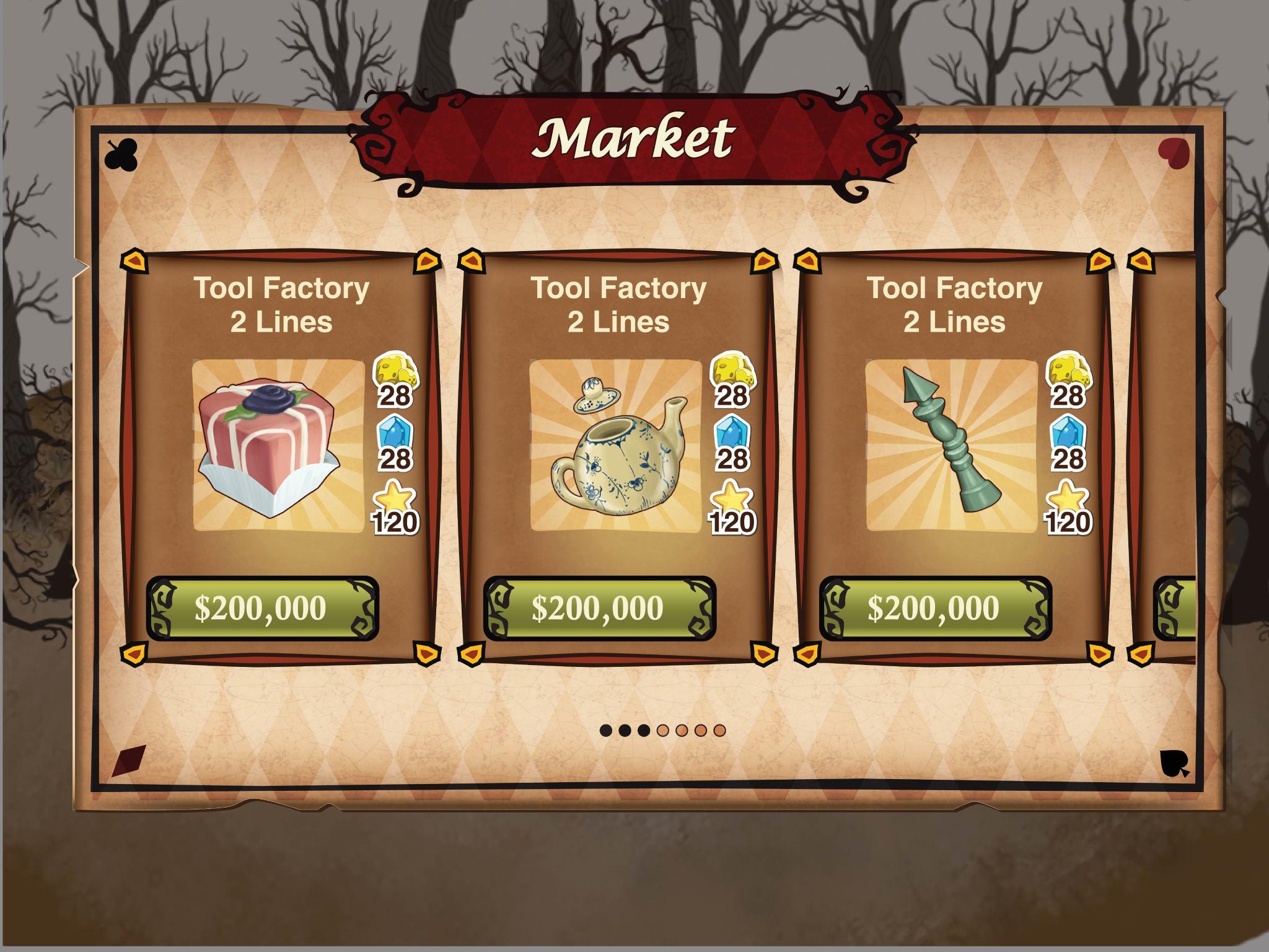
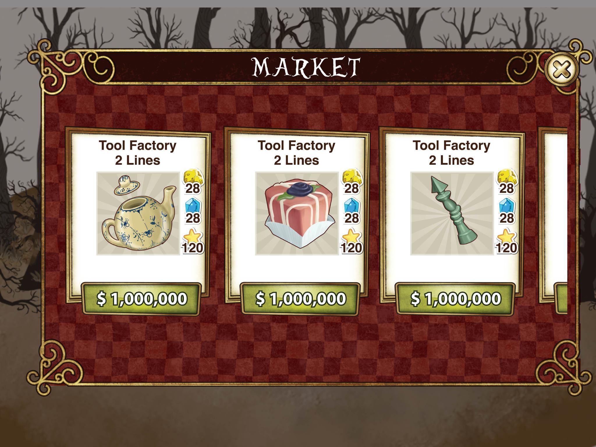
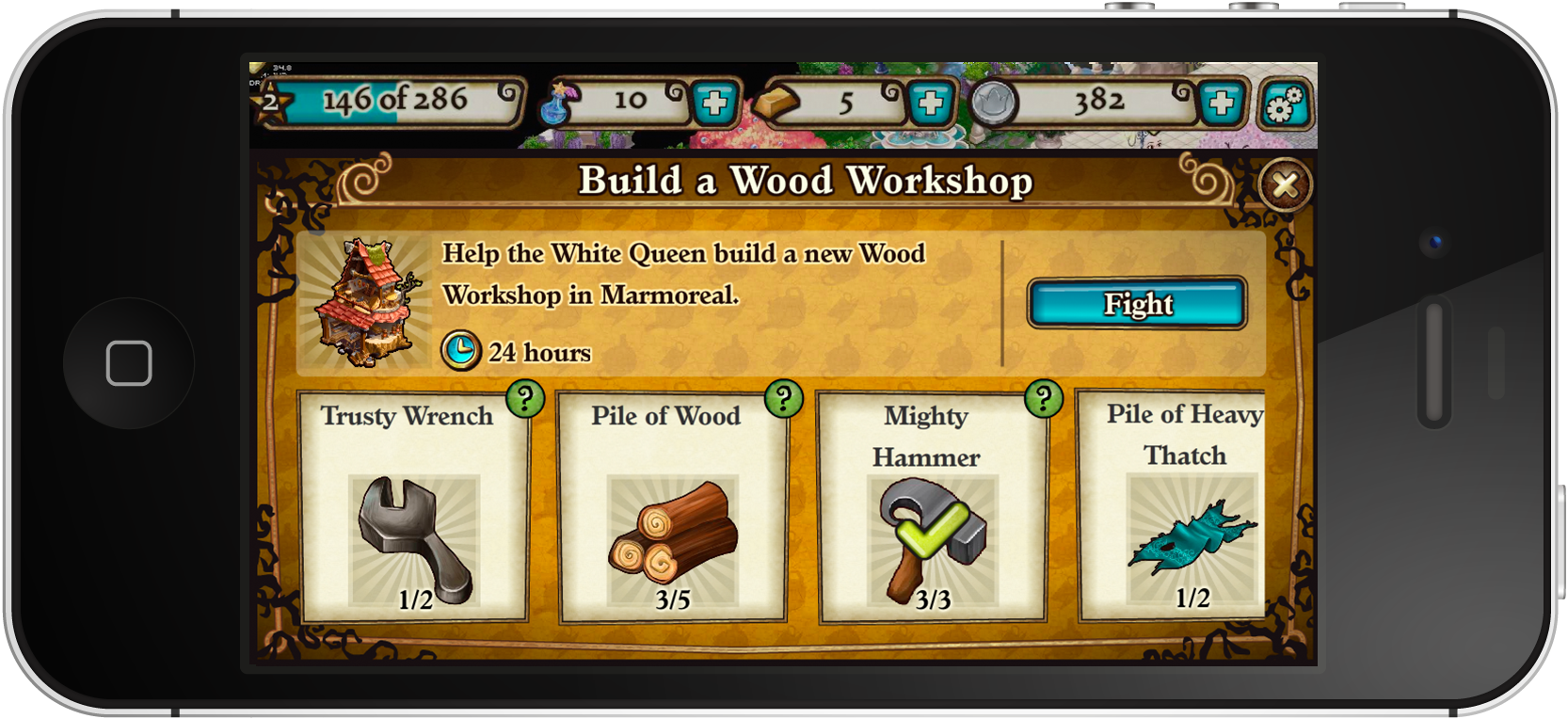
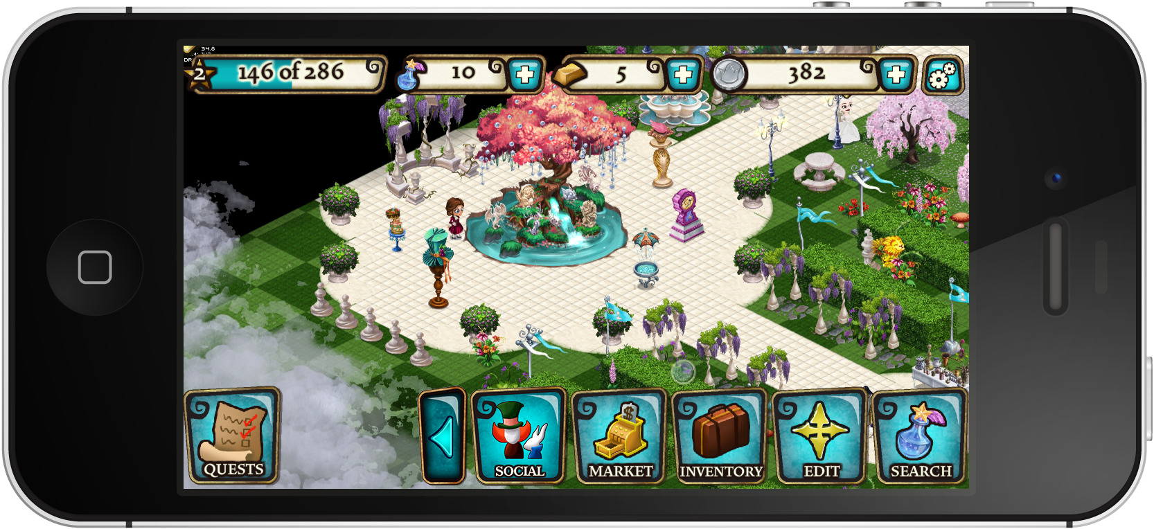
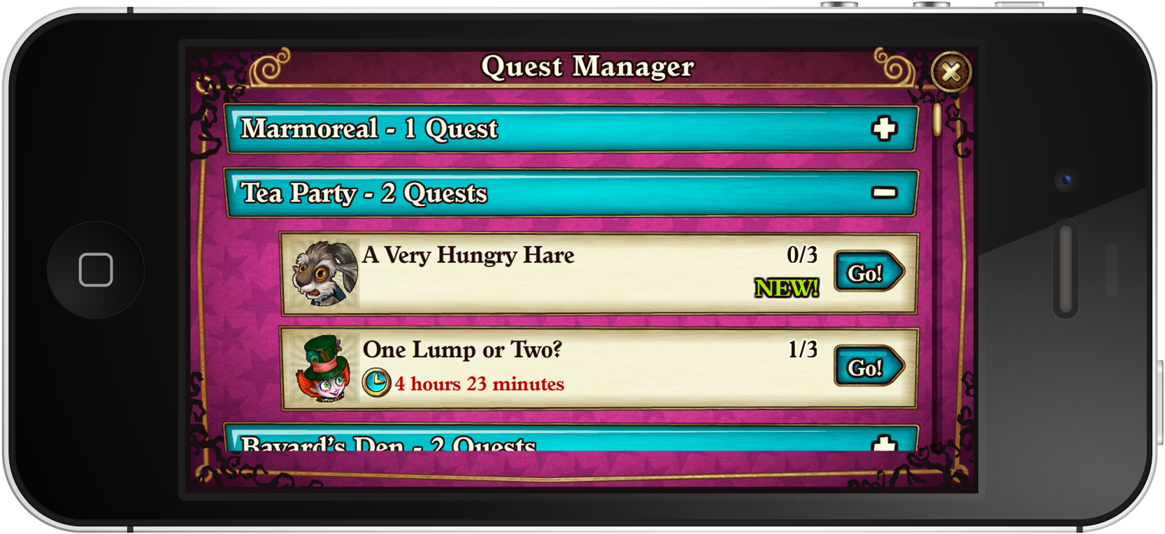
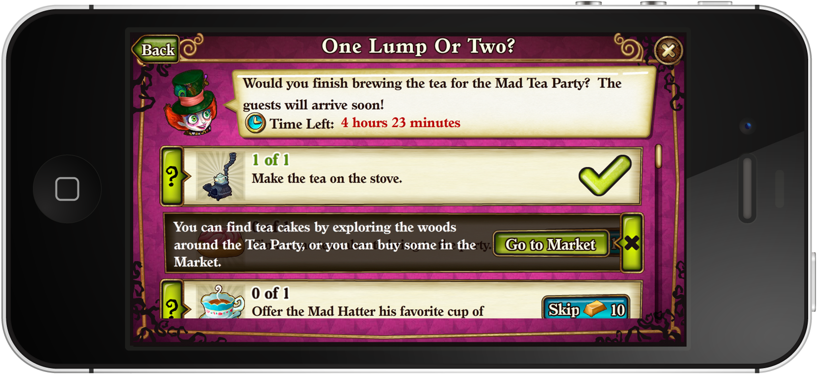
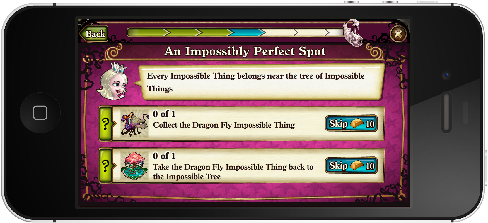
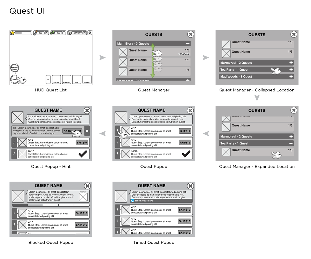
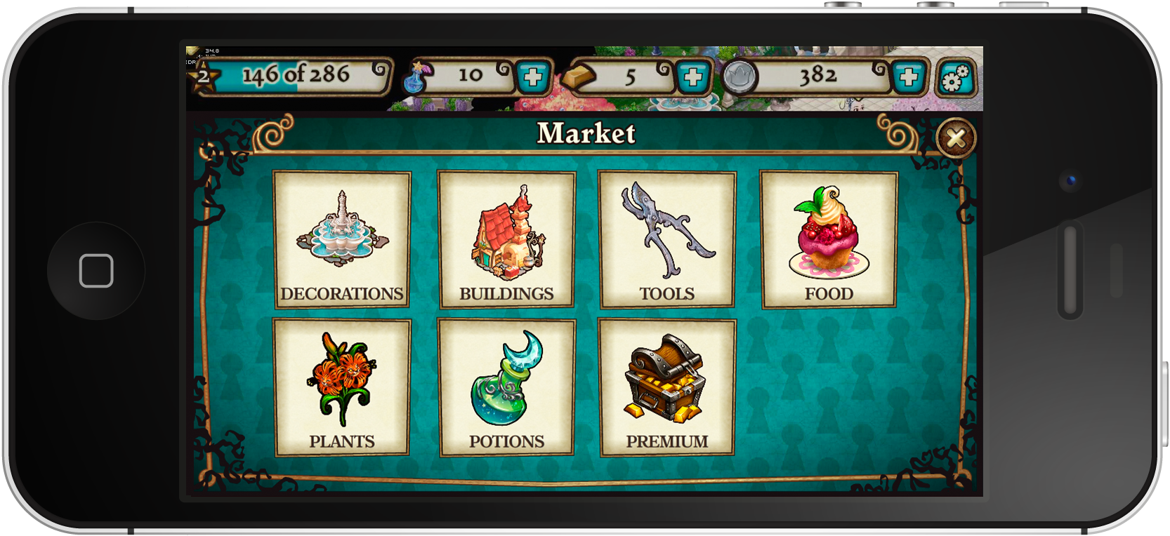
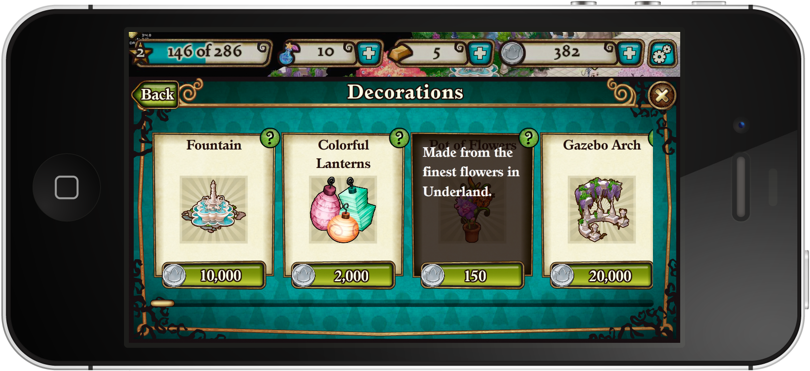
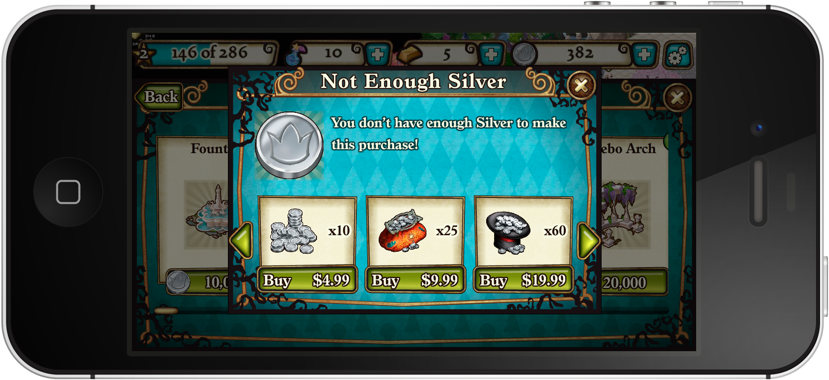
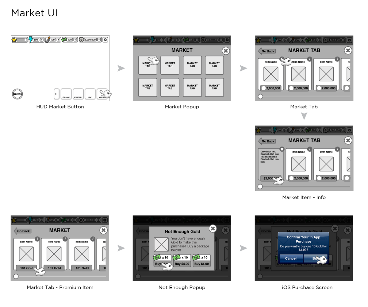
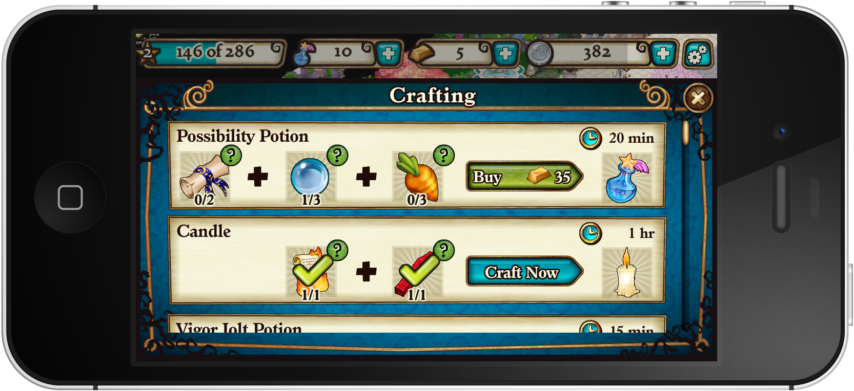
The shipped experience — screens, wireframes, and the style guide.


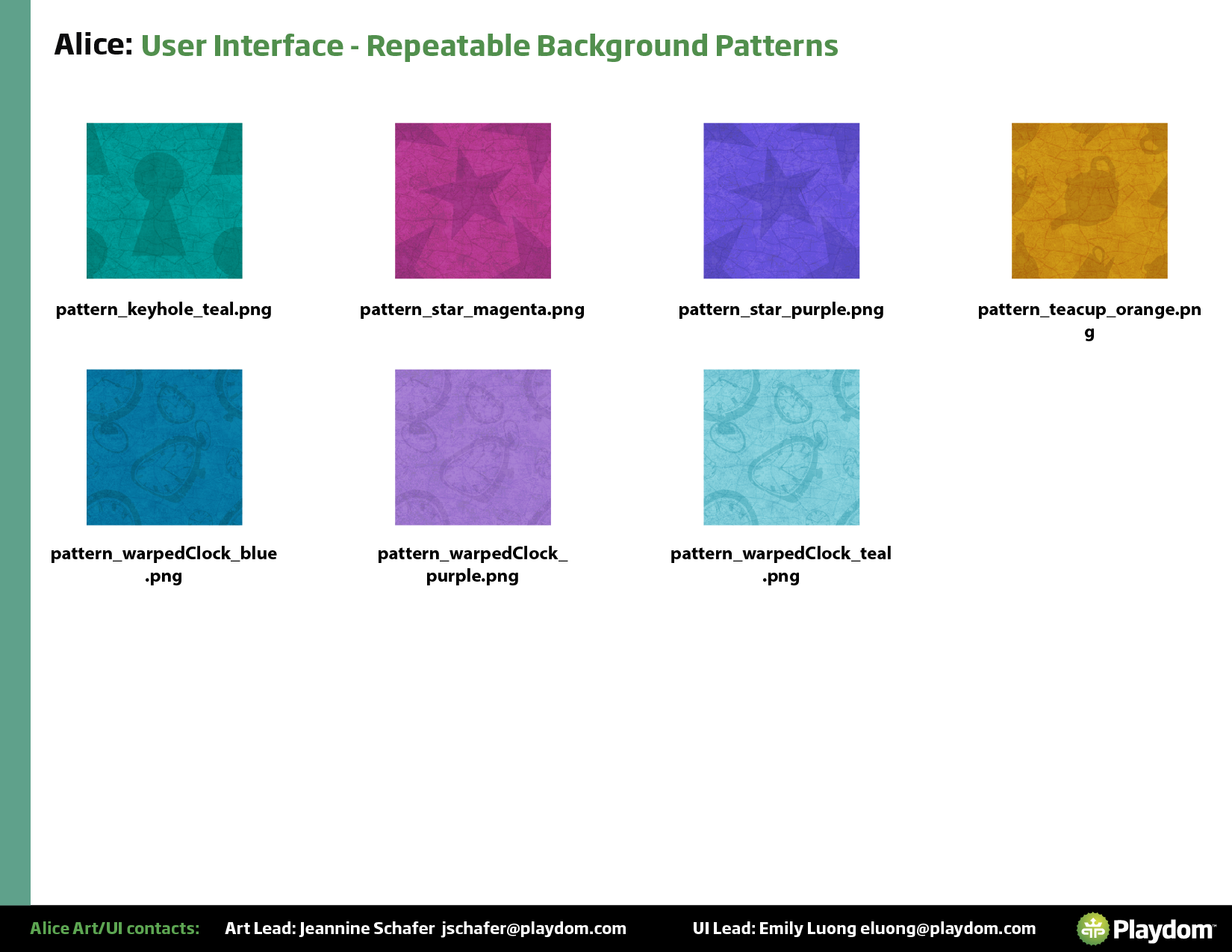
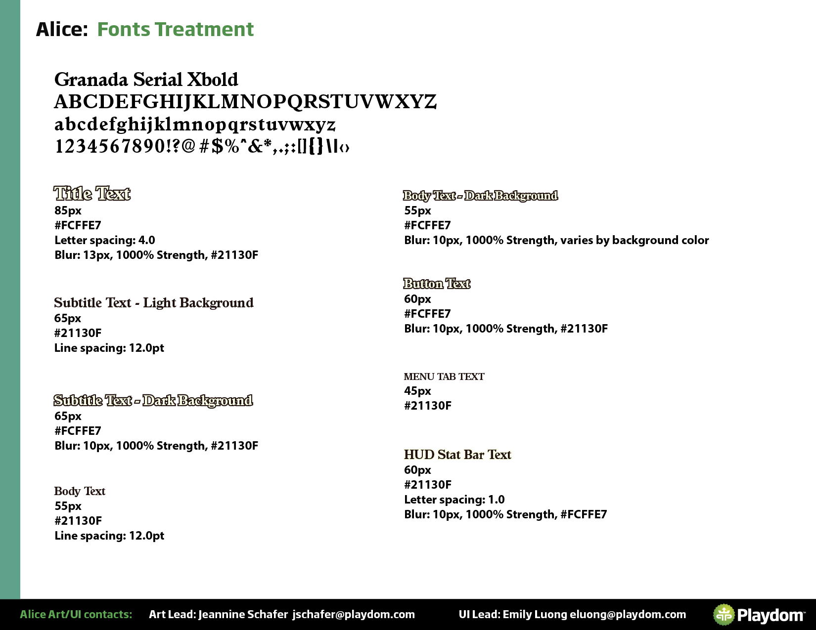
The UI style guide — a shared language for the team.
As Lead, I was also responsible for the UI style guide — documenting the typography, color system, component library, and button states so the full team could work consistently. Given the collaboration involved in a project of this scale, the style guide was essential for maintaining visual cohesion across every screen.